Submitted by Ambrose on Sun, 2015-07-05 18:59
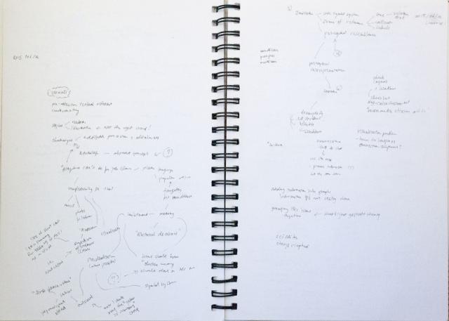
You might not think an editors’ conference would have anything to do with graphic design, but in fact it did. Other than getting to know “industry standard” practices and expectations, it was revelatory to look at graphic design from the (stereotypical) editor’s viewpoint. My two surprising finds: Graphic design is misunderstood in editing circles, and bad graphic design is giving graphic designers and other artists a bad name. Since summaries of the relevant sessions have already been posted, I’ll just comment on a few observations I had.
“Graphic designers,” it was said during the Q&A at Sunday’s “Clear Communication” session, don’t care about communication but instead care “only about visuals.” This is, of course, a grave misrepresentation, since graphic design is all about communication. In fact it is so much about communication that it’s also called “communication design”; I find it incredible that a quarter century after graphic design has been called communication design people are still claiming that graphic design is not about communication.
So how did this misrepresentation come about? Friday’s “How and What to Edit in Visuals Accompanying Text” gave us a clue. The presenters showed a lot of badly designed visuals that don’t communicate (including apparently-not-to-well-conceived illustrations, badly designed infographics, and badly set text). Eventually I just had to say “bad graphic design is giving us artists and designers a bad reputation.” Editors have this misinformed idea that communication design isn’t about communication because there is simply too much bad art out there.
Outside the art and design circles, it also appears that the term “illustration” is misunderstood, since one of the presenters said the style of a graphic can be “realistic” or an “illustration”—The problem here, of course, is that illustrations can be realistic. “Illustrations” is not the right word (which should be a big problem in an editing conference); the correct word should be “caricatured.”
 The idea of caricature returned later when the “suppression (?) of irrelevant details” was mentioned. Suppression of irrelevant details is, of course, caricature. Strangely, McCloud’s Understanding Comics was actually mentioned. Perhaps the word is too technical for people outside art the design circles—or perhaps I see it as a normal word only because I’ve worked so long with this prof.
We all know that colours have cultural significances, but I found it bizarre that at one point it was suggested that yellow should not be used because it would be misunderstood as indicative of a warning. I was shocked; not even American and Canadian designers would agree to that statement, and the example was an illustration. I had always felt Ontario to be boring but I’d have never thought of this as one of the reasons; in a multicultural country like Canada such a claim also sounds culturally biased.
It was also mentioned that (if I read my notes correctly) neuroscience tells us that our brain cannot hold more than seven pieces of information at the same time. But I was skeptical because this contradicts Malcolm Gladwell’s claim (which I happened to be able to check because I happen to be from the right linguistic background). That said, since I’m actually working on a neuroscience project right now maybe I need to somehow weave this claim into some sort of query that I can ask the neuroscience people; this might prove productive :-)
This is about all in terms of comments I can still make out of my notes, but perhaps I should mention two more interesting connections near the end: “Grouping like items together” was mentioned (Gestalt theory, something I’ve never been strong at); and reading information that isn’t really there into graphs (semiotics—debates around iconicity in particular—, another thing I’ve never been strong at). There was actually more semiotic talk earlier when perceptual resemblance (and of course, the comment about yellow that I disagreed with) was mentioned. This has little to do with editing but I guess these are reminders that I should brush up on my theory.
For some reason that I’ve already forgotten, I tweeted a few times during Sunday’s session but didn’t take any notes. Why I didn’t take any notes on Sunday will forever remain a mystery…