thesis

Forgot how to make a book

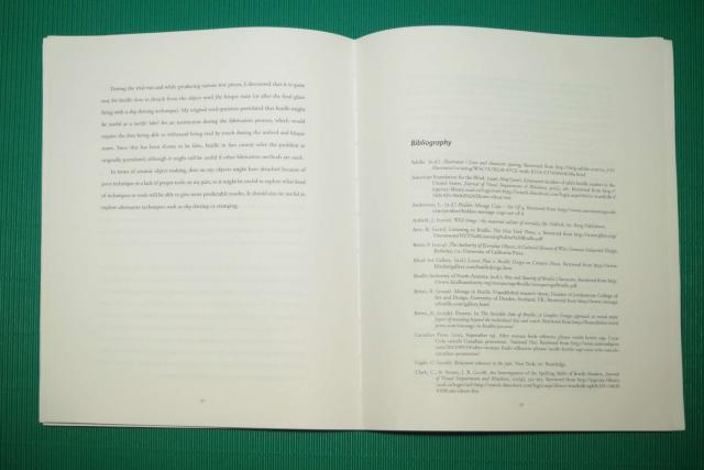
Almost a year after I printed a copy of my thesis (intending to put it on display at GradEx, but shelved the idea when I thought the print shop didn’t print it), I finally took a few hours to gather all the signatures, sew them together, and glue them together into what vaguely looks like a book. It’s still not in book form only because my X-acto is with my box of tools in the studio and I forgot to print the cover. Half-finished book, opened flat Yes, of course this was going to be in the form of a real book, because that’s how all the process books at GradEx look like! :-) Anyway, while I was doing this, I kept thinking things like “I’ve forgotten what the signature size was”, “I’m supposed to know how to do this”, “too many signatures!” and “I think I did this wrong,” A year after I did the Student Press’s bookbinding workshop I have already forgotten how to sew signatures together. I still managed to bind the whole thing together. I’m going to get my X-acto back tomorrow and do a layout of a front cover and print it out somewhere… (Hmm… that will have to be printed at 12×18…) (Oh yeah… and don’t bother to use staplers. Thread and needle is actually easier because you have more control. And awls… they make holes that are too big; I actually like pins better…)
“school sucks in the summer”

It is true that working on campus is way better than working at home. At home I have to remember to put my headphones on (which is recent discovery) and I don’t always remember to do that. But I’ve been much more productive on campus either in the studio or in the Great Hall (but not in the bistro area), even when compared with when I work with headphones on, or even compared to when I work at Robarts. The fact that campus closes early and isn’t open on weekends really is making me very unhappy. Yes, I’m still unhappy.

a good model thesis?

So I dropped into the grad office again today to look for theses to read, and I noticed that there were a few new ones that I’d never seen before and that didn’t look like anything I had ever seen. In fact they looked so different I thought maybe they were not theses. They I pulled them out and they were theses. Must be the new “bespoke” formats… So took out a few and the first one I tried to read was Spooky Action at a Distance: Fragments of Presence in Remote Objects : A Master of Design Thesis by Jackson McConnell (yes, that’s a title with a subtitle with a sub-subtitle). Less than halfway through scanning it I realized that I virtually did exactly the same thing as he did (except, very possibly, worse), and how I wrote my draft is virtually exactly the same as how he wrote his final thesis (again, except, very possibly, worse). So have I finally found a possible model to follow? I sure hope so…

How to data merge QR codes with InDesign

So how did I end up mail merging my QR codes? My solution turned out to be typographic after all, but it did not involve contextual glyph substitutions. The key to mail merging QR codes is to realize that while we cannot control formatting in InDesign’s data merge, square shapes exist in Unicode, so if there is a programmatic way to generate the dot patterns, we can pick a monospaced font, vary the glyphs used, and end up with a scannable QR code. One way to generate the dot patterns is to use the qrencode tool by Kentarō Fukuchi. Its “-t ASCII” option is especially useful, as this means we don’t need to interface with the C library; the ASCII output can easily be parsed using a Perl script or similar and turned into a simple pattern of zeroes and ones. So two things came out of this exercise: First, InDesign cannot handle ideographic spaces (U+3000) in data files, so CJK fonts are out; and second, qrencode -t ASCII doubles up the ASCII characters so that the dots come out visually more or less correct, so to convert this output into a dot pattern we need to deduplicate the ASCII characters. The key portion of my code looks is this:

sub get_qrcode ($$) {
    # Note that qrencode uses ## for a dot (and 2 spaces for no dot), not just #, so we need to deduplicate first
    my($s, $quality) = @_;
    my $h = open(INPUT, '-|');
    die "$0: exec: fork: $!\n" unless defined $h;
    my @qr = ();
    if (!$h) {
        my @cmdline = ('qrencode', '-o', '-', '-s', '1', '-l', $quality, '-m', ' 0',  '-t', 'ASCII', $s);
        exec { $cmdline[0] } @cmdline;
        die "$0: exec: $!\n";
    } else {
        for (;;) {
            my $s = scalar <INPUT>;
        last unless defined $s;
            chomp $s;
            $s =~ s/([# ])\1/\1/g; # deduplicate
            my @spec = map { ($_ eq '#') + 0 } split('', $s);
            push @qr, [@spec];
        }
    }
    return @qr;
}
Provided that qrencode is installed, this code will convert the input string into a QR code bit pattern with the specified quality. To form the dots it is necessary to choose a perfectly square glyph. Since I was dealing with print, I can also pick a rectangular glyph and scale it horizontally to make it square. One obvious candidate is U+2588, which fills up the entire glyph space and is naturally square in most CJK fonts. Unfortunately if we use a CJK font we will need to use the CJK space, and it turned out that putting CJK spaces in the data file will cause InDesign to not recognize a UCS-2 file as UCS-2. So there are two options: Use U+2588 with a normal monospaced font and scale the glyphs horizontally, or use something else such as U+25A0, which is a smaller square dot. It turns out that if we use U+2588, we will need to typeset the dots in a really small point size, like 2pt. If we then generate a PDF and view it in Apple’s Preview tool, the QR code will get greeked, so this is undesirable. Using U+25A0 allows a larger point size to be used which decreases the probability of the QR code being greeked; the only problem is that with U+25A0 spacing cannot be as exact. It’s also worth noting that InDesign turns out to be incapable of handling UTF-8 in data files. Although you can specify Unicode, Macintosh platform (and Unicode on the Macintosh platform invariably means UTF-8), InDesign will silently ignore the file. You have to use little-endian UCS-2, which InDesign will interpret as “Unicode, PC platform” even if you don’t specify any options. Lastly, with a programmatic way to generate QR codes, we also don’t need to worry about choosing a quality. We can just let our code search for an optimal quality. For example, my code (clearly not the best code as I noted in the comments) currently has the following:

sub qrcode ($) {
    # Compute the best QR code by sucessively going from the highest to lowest quality.
    # Stop when we get something of the correct size.
    # Don't bother returning an error value because only 1 line uses this function and that line uses its own error checking.
    my($s) = @_;
    my @qr = ();
    for my $quality (qw(H Q M L)) {
        @qr = get_qrcode($s, $quality);
    last if @qr == $qr_code_size;
    }
    return @qr;
}
Just define some constraints (such as a fixed size for the dot pattern, $qr_code_size in my case) and let your code search for a quality that is adequate for your requirements.

confluence of lab and thesis^H^H^H^H^H^HMRP, again

A few problems surfaced today while I was trying to beat InDesign into submission mail merging my questionnaires. Basically, I tried too hard customizing the questionnaire booklet, and I found I had to mail merge the whole thing, not just the cover and the first signature. Most of InDesign’s deficiencies (well yes, there are many…) could be worked around, but one remaining thing stuck out: How do I mail merge a QR code? Will image merge actually work? (Oh yes, and I really feel offline formatters like LaTeX are still light years ahead of commercial page layout systems in terms of mail-merge-ability.) When I was waiting for the train back home I actually thought about contextual glyph substitutes. This is, of course, what we talked about in the lab last week. Obviously, this would be a crazy idea, since I have zero experience making this kind of stuff, but if I can’t get InDesign to work, what else could I do?… Maybe I’ll just generate 18 INDD files and replace the QR codes by hand… That’s probably going to take less time than figuring out how to create a custom OpenType font…

thoughts about Glenn Adamson’s “Thinking through craft”

I just finished reading Glenn Adamson’s (2007) Thinking through craft. I started reading it to find material for my thesis, and I ended up completely disappointed. Yes, disappointed, but no, it was not a futile exercise, because it taught me two things. First, Adamson has managed to show me the irrelevancy of the so-called avant garde; he has managed to show me that art criticism is essentially just the biased opinions of a few individuals completely disconnected from the non-art world and nothing more. And secondly, he has managed to make me “get” feminist art, at least in a way: According to how he described it, feminist art can totally be reframed in racial terms and still be completely valid. Art criticism, as Adamson has described it, is absurdly sexist and racially biased. And if Adamson has also managed to show it as irrelevant, I don’t feel sorry at all to be left out of an irrelevant discussion. Adamson also shows a complete ignorance of basic design terminology or the realities of design. Perhaps that’s why he didn’t get “craft” (as Ric Grefé said during AIGA Pivot’s post-conference, we must not give up our craft, or we lose our specialness), and perhaps that’s also why all the other avant-garde high art critics also don’t get “craft”. They have no right to critique it, if their irrelevant babblings can even be called critique.

art as an intrinsically non-inclusive practice

One thing we in the ceramics studio has been constantly reminded of is that ceramics is considered inferior because it is craft and not art. We are constantly being reminded of not only how the material arts are looked down upon in our school, but also how the art world as a whole is unfair. Yesterday, when I finally got to going to the grad office to borrow some theses to look at (not borrow as checking out the thing, but as reading some library-use-only item on the spot). While most of these theses just made me even more worried and depressed, I did notice a couple of books in the bibliographies that I might find useful: One of them was Glenn Adamson’s (2007) Thinking through craft. So I didn’t even wait until I got back home or to the studio; I just took out my computer on the spot and searched our library catalogue: The OCAD library has it, but it was checked out, so I immediately tried the public library instead, and found that both North York Central and Toronto Reference have a copy. According to Adamson (p. 39), the defining characteristic of art, according to art critic Clement Greenberg, is “opticality”, that is, art exists to be looked at. This “opticality” is, in a way, seen as a condition for “autonomy” (i.e., the quality that a piece of artwork can be isolated from its environment and exist by itself, devoid of context), first proposed by the Marxist (gasp) Theodor Adorno (pp. 9ff) that is so prized in the modern art world. (Obviously, anyone coming from math or translation would be immediately suspicious of anything that alleges itself to be self-sufficient or autonomous from all context. In our world such things don’t exist and cannot possibly exist. But let’s ignore that for now.) Ignoring the fact that Adamson described Greenberg’s idea as “counter-intuitive” (p. 41) and mentioned that it has been attacked ever since it was proposed, an assumed primacy for “opticality” does seem to explain why the material arts are looked down upon. This would explain why anything two-dimensional would be more highly-prized, as if any technique used for two-dimensional work must be more difficult (this is not my observation, but a paraphrase of RT’s observation when we, the studio regulars, were discussing Project 31 in the studio), as if any two-dimensional work must be more valuable than three-dimensional work. But this also brings us back to the only art course in my program that we had at the start of our second year (or even farther back, in first-year foundations, if anyone still remembers that one reading we were required to read): that is, can art be inclusive? If opticality is of paramount importance, art can never be inclusive, or at least art centred solely around opticality can never be inclusive. If we aim for inclusivity in art, the primacy of opticality must be dethroned.

doomed

When Danica finished her thesis three days ago and the three of us in the studio went out, she mentioned GradEx was next week. I thought that was soon but I didn’t realize what that implies for me. The thing is, the nominal deadline for submission to Empty Bowls is just three weeks away, while the actual event is just half a week after that, and I have not even submitted a draft of my ethics proposal For this to be part of my thesis MRP I will need to get approval in less than three weeks. I am doomed.
Syndicate content