accessibility

Most email newsletters are garbage

Most newsletters these days aren’t sent with normal mailng list software, but from commercial providers like MailChimp. This probably has a lot to do with the fear of being accused of sending spam.

The thing is most of these newsletters are garbage: long and unpronunciable links, images with no alt text. Since these are often just a series of images, the entire newsletter often contain no information at all – other than the address of the sender at the end.

Here’s a typical link dump, from the Mountain Equipment Co‑op:

Screen shot of a newsletter from the MEC
A screenful of text from a recent newsletter from the MEC. The newsletter consists only of a series of linkified images. None of the images have proper alt text. All the links are spammy-looking, obfuscated, unpronounciable tracker links that hardly even fit on a 145-column terminal.

Do you think anyone who sees this kind of garbage will bother opening the images to see what the images say? (Let’s assume you actually can see.) Nope, I don’t think so?

Why then do these companies spend so much time sending garbage like this?

You can do bettter.

And some have done better. Here’s one from the Association of Registered Graphic Designers:

Screen shot of a newsletter from the RGD
A screenful of text from a recent newsletter from the RGD. The newsletter consists of readable paragraphs. Links are relatively short and pronunciable, although some can obviously be shortened further.

Which one do you prefer, as a reader?

OCAD Bookstore should do better (yes, @51OCADU)

I received some promotional mail from OCAD’s bookstore today, and this is it, in its entirety:

Having trouble viewing this email? Click here. Terms of Use | Contact Us

Without loading remote images (reading email with remote images is an unsafe practice), the mail they sent me is pretty much completely devoid of content.

So what if I clicked the link? I chose to do it on my text browser and I found that it’s pretty much just the same thing, only worse:

Having trouble viewing this email? Click here. [c8652cd6-9923-4d17-abae-bd5543fc82ca] [6b674e6e-88df-406a-9e68-8645794bc916] Terms of Use | Contact Us. OCAD U Bookstore, 51 McCaul Street, Toronto, Ontario M5T 3K4 Canada. SafeUnsubscribe? Tell a Friend! | Update Profile | About our service provider. Sent by manager@51ocadu.com

The mystery: Why did they even bother? If someone is “having trouble” seeing the original email, they probably can’t see images. Why repeat exactly the same thing, with no alternate text?

I was viewing the linked page on a text browser, which when confronted with alt-less images is smart enough to truncate some file names and replace some small ones with asterisks. (Text browsers, after all, are still visual interfaces.) Blind people, using screen readers, are going to be tortured with the images’ super long file names.

I know our bookstore is run by U of T, but if I called out the U of T wouldn’t it be even more damning? This is 2016, friends.

Should PDF be killed too? (second thoughts on @NellChitty’s (rhetorical?) question)

Yesterday, Vitamin T retweeted an article on Web Designer Depot claiming Flash is dead (in Chrome), and we really mean it this time.” The article is surprisingly misinformed. (For one, Linux users will not “rejoice” because finally throwing out a piece of garbage that has been gathering dust in the attic isn’t cause for rejoicing – Flash is not working on Linux and has not been since ages ago. Let’s not even get into the question of how YouTube is even relevant.) But the article does suggest an interesting related question: Should PDF be killed too? Just as Adobe has artificially kept the zombie of long-dead Flash version 11.2 “alive” on Linux, what they’re giving Linux is also just the zombie of long-dead Adobe Reader version 9.3.3. Yet even Apple’s Preview on recent MacOSX versions cannot understand some of the newest PDF’s generated by Adobe Reader DC, such as those with custom stamps. If even Apple’s Preview is incompatible, Adobe Reader on Linux is useless. However, Adobe Reader DC features are increasingly used by, for example, professional editors. Just as most professional editors demand that their clients use Microsoft Word, they also demand that their clients use Reader DC. If the client uses only free software, then, it will not be possible to satisfy the professional’s demand except by succumbing to non-free software running on non-free operating systems. Then what Reader DC represents is really a privileged power (major software companies) trying to subjugate an already-oppressed population through the hands of unwitting accomplices. If a PDF win is equivalent to oppression, then PDF must be defeated. Perhaps the only defensible answer to Nell’s (rhetorical?) question – at least in light of current circumstances – is that PDF must lose and HTML must win, perhaps in the form of EPUB.

Why blindly following accessibility guidelines isn’t always a good idea

I have not been logging in to my student email as often as before, and when I logged in earlier today I noticed this — am I allowed to use the word travesty? —: Slightly censored screen capture of a piece of email I received that is replete with meaningless repetititons of Title: XXXX Logo - Description: XXXX Logo” and worse things 
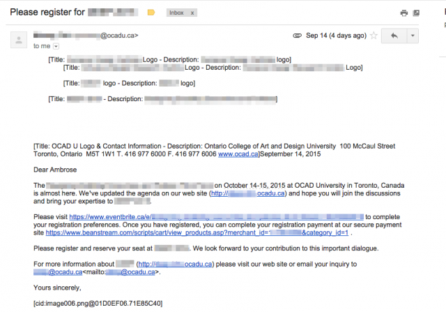
Does the endless repetition of “Title: XXXX Logo - Description: XXXX Logo” make sense to you? Does “[cid:image006.png@01D0EF06.71E85C40]” look meaningful or accessible to you? No, they don’t, but this is what you get when you blindly follow “accessibility guidelines” and trust Word to mail out form letters. Which brings me back to a point I’ve been trying to make since first year: You can’t divorce alternate text from its true roots: As fallback for text browsers and plain-text offline formatters. In other words, as fallback for what is to be inserted in place of the image whenever — not just when the final output is speech — the final output is plain text. This is why alternate texts that say “XXXX logo” are almost always wrong, or for that matter why (as this example shows) anything that results in “Title: X - Description: Y” is also almost always wrong. Alternate text for screen readers was not the original intent; being usable for the screen reader is actually the curb cut. Alternate text was invented for accessibility, for sure, but the true intended medium was the text screen, not the screen reader.

Some thoughts about RGD’s accessibility webinar (Hi @good_wally)

[I had originally planned to just comment on my question, but what I wrote in a related email discussion sort of didn’t make sense. So let me write that down here too. So these really are just unorganized random thoughts.] Let me comment a bit on the question I posed near the end of the webinar, which ended up being literally the last question that got through: “What best practices would you recommend if the design had to work with a CMS hostile to doing things semantically?” This is, of course, a real example, one that I had already mentioned previously. In this particular case, which is a different case than what I had blogged about last time, what I found was that the CMS was so hostile to authors that I could not even get Microformat 1.0 content (dtstart and dtend specifically) to stick. Let us think a little bit here: Microformats are designed to work in pretty hostile environments. But in real-world environments that some designers have to work within, not even Microformat markup can survive. How can HTML structural elements survive? The answer is they don’t. I was not talking about environments where the the designer has the power to reconfigure the CMS (if so the question would have been moot); I was talking about situations where the designer is working with a non-technical client (with a CMS created by someone else) who has neither the technical skills to even go to the Administer screen nor the financial resources to hire someone to reconfigure their CMS. But they’ve already budgeted the money to redo their CMS—which you have no influence over either. I’m talking about a 100% hostile situation which you have no control over whatsoever. So what do we do in such cases? When people talk about making existing sites accessible this is the reality. Whether the CMS in question is WordPress or Drupal isn’t really relevant; in this particular case the hostile CMS is actually Drupal, but you can’t reconfigure it. In any case, I think the RGD is doing meaningful work in the accessibility area. A few days ago on an email discussion I actually cited RGD’s AccessAbility handbook because the RGD is actually one of the very few organizations that are not buying into the myth that print accessibility equals “large type size.” But someone disputed RGD’s ability to create accessible PDF files because the “accessible PDF” version of the handbook was not produced by the RGD but by an outside contractor. While the latter is true, I think, to be fair, this need to be put in some context. First of all, producing an accessible PDF from InDesign is not straightforward, and the steps Adobe documented (the same steps described by ADOD) do not actually work, and I can say this because I tried it when I did my issue of Cadmium (the OCAD SU zine that’s no longer being produced) and verified that the documented procedure did not in fact work. The other thing, which is quite tangential, is that (I might add having Accessibil-iT do the final work does not prove that RGD does not have the capability — it’s normal for graphic designers to contract out non-core tasks anyway —, but that’s not the point I’m trying to make) RGD has raised some points that do not seem to have been addressed by most other people talking about accessible print. So they are tackling a conceptual problem, with the appearance (let’s say this for the sake of argument) that they might not have the best practical skills (or craft). As our chatting at a pre-DesignThinkers student mixer two years ago showed, this is actually very “OCAD.”

Web accessibility is straightforward, or is it?

One of the two things I needed to do in the past week was to post some information on an existing web site. Pretty straightforward information really, but how do you mark it up? Here is the copy, in disguised form of course:
Aardvark New Year Dinner Saturday, February 21 New Aardvarkia Banquet Hall Cost: $38 (VAT included) 6:30pm: reception 7:00pm to 9:30pm: dinner and speaker presentation Join us in celebrating the Year of the Aardvark! Noted author Tia Aardvarka will be present to talk about her recent work, Attack of the Zombie Blue Aardvarks and the Re-emergence of Totalitarianism.
The copy was to be posted in a Drupal-based system that deletes HTML5 semantic tags and aggressively strips away most attributes (including even language and ARIA attributes). The CSS stylesheet is locked down so you can’t create new styles. Most of the existing styles seem to be UI-related and not much is useful for styling content. So how do you mark this up, especially the top two blocks? The first line is easy: It’s an h2. The usual lazy way to mark the rest of the first block up would be to treat it as a list and style the bullets out, but you can’t, because you can’t change the stylesheet. You could treat it as a single paragraph with br tags but this will sound awful with a screen reader. Or maybe you could do multiple divs, which sort of makes sense but then you can’t create the space between the various blocks. The second block is obviously true tabular data, but if you styled it as a table there’d be an odd-looking space on the first row because the first cell on the second row contains so much text. So do you treat it as a table, or do you not? If you don’t, you get into the same situation as the first block. So even this seemingly straightforward copy is creating a lot of problems. How do you handle such situations in a locked-down environment? Perhaps, perhaps we should start by doing some experiments so that we can know how to rank our options?

Why ATutor is inaccessible and always will be

Some time ago I had the chance to talk about ATutor with one of its developers, or perhaps that was not the right word: I had a heated argument with one of its developers was more like it. Until that point, I never knew we hold such divergent views on web accessibility. The crux of the heated argument was, in essence, ATutor’s reliance on Javascript for one of its most basic and essential functions, namely to log the user in, for what amounts to, technically speaking, no justifiable reason; it was, in a very real sense, a deliberate exclusion put into place. For someone who had primarily been a text browser user until just a few years ago, this was unacceptable, and this was doubly unacceptable when ATutor claims itself to be usable with text browsers. This is in effect, one could argue, a textbook case of “inaccessible” — it doesn’t matter if you can use its other functions, it is inaccessible if you can’t get in. I had, and still have, the opinion that if a web site — unless it’s an online game — relies on Javascript for any essential functionality, the site must have serious design flaws somewhere. The flaws might be hidden from view or latent and yet to be discovered, or the flaws might even have nothing to do with the “Javascripted” functionality; but, I maintain, some serious flaw must be present and it must be fundamental, because such use of Javascript demonstrates a fundamental flaw in the developer’s mentality. This was, or should I say is, not the opinion of ATutor’s developers. To them, Javascript is fair game because any “modern” browser would have it. Besides being insulting (I still consider w3m modern, thank you very much, and people who consider Javascript a security threat still exist), less than a month ago I happened to run across a BBC article about a UN accessibility report on web sites that stated quite bluntly that one of the “key shortfalls” for 73% of web sites tested was that they “relied on JavaScript for important functionality“ because “JavaScript does not work with some screen readers used by those with impaired vision.” [emphasis mine] Were ATutor tested, the UN testers would have failed it for relying on Javascript for, quite literally, its most essential functionality. This was vindication for me: I was told they didn’t consider Javascript reliance an accessibility problem; the UN thought otherwise. Some time ago I was told Pina can’t use ATutor: there could not be anything more revelatory than this. And I still maintain that there is no essential functionality — zero, nada, zilch — in ATutor that absolutely requires Javascript. What’s worse, I looked at their code base and their code is not amenable to automatic testing. In our program we claim to aim for Agile, but Agile relies in a large part on automatic testing (in the form of TDD or BDD). Short of a major code overhaul, there’s no way TDD could be performed on ATutor’s code. Thus the false claim that ATutor works for text browsers (most likely it used to in an earlier version) when in fact it doesn’t and no one noticed. Two months ago when I was looking at its code I wrote it was a “genuine piece of crap.” Their developers claim integrating small patches is expensive, but ATutor in its current state can’t be tested; of course the integrations are expensive. It wouldn’t be an exaggeration to say that the mentality of how ATutor is developed flies directly in the face of everything taught in our program, in particular designing for the extremes and disability as a condition caused by design flaws in the environment. Unless ATutor’s developers have a change in mentality, I don’t foresee ATutor achieving any semblance of true accessibility any time soon, if ever.

How should we add alternative text for diagrams?

I’ve mentioned this before to people but never wrote it down: How should we even begin to handle graphs and diagrams? What is the “alt text” for a graph, a schematic, floor plan, infographic, or UML diagram? Just consider this diagram: (A UML diagram used for the discussion) 
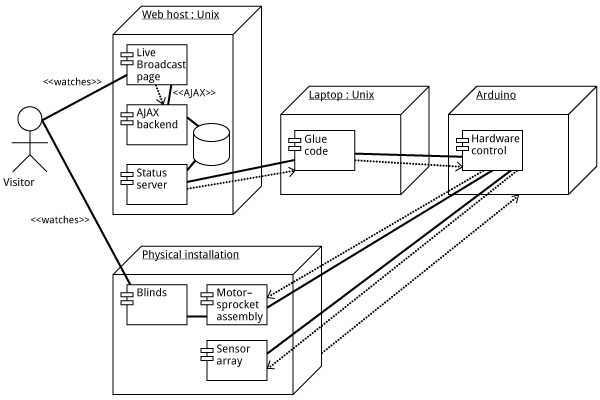
How should we even describe this as an “alt text”? (Let’s ignore text browser users for the moment.) Describing the picture certainly wouldn’t work; what matters are not the visual elements themselves, but their relationships to each other. Even worse: Imagine this being exported into PDF (or SVG, or EPS), then embedded into InDesign. Suppose the InDesign file is going to ultimately end up as an accessible PDF. But the text in the diagram is going to be a jumbled mess. So what accessibility are we talking about? Are we deluding ourselves? This has serious implications: Imagine, for example, a piece of online instructional material full of such diagrams. Under the AODA organizations are supposed to be able to supply this in an “accessible format.” What does it even mean for this to be accessible?

So long

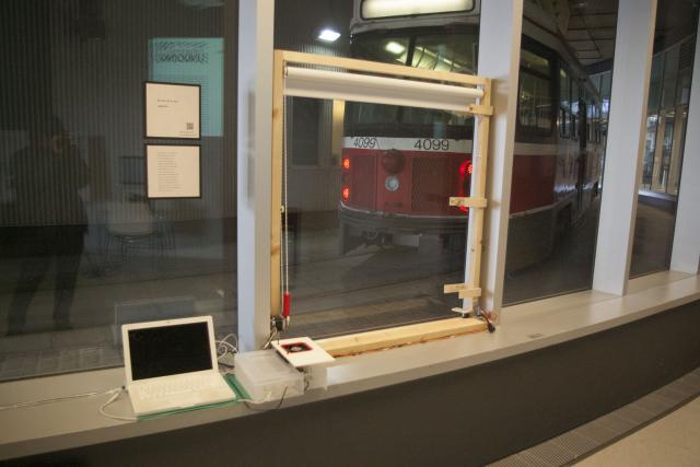
Got here at 4:30pm (having missed my class at 12:00pm) and found that things were already being taken down. I used to really hate exhibitions being taken down before their advertised closing time; I guess I still hate it, but have to acknowledge that such is reality. I just wish if people are tearing down at 4pm, they should have advertised today’s gallery hours as 12:00–4:00pm and not 12:00–5:00pm.

Is a system-provided screen reader necessarily stable?

I should not be doing this at such a time in the semester, but I kept the screen reader running for a few hours today, and I found, to my dismay, that the answer is no. A system-provided screen reader is not necessarily stable. The first program to fall victim to instability was Terminal. It started crashing for no apparent reason, and at one point it repeatedly crashed after less than a couple of minutes of usage. Terminal and VoiceOver do not play well together. The second program to fall victim to instability was Safari. After a few hours of screen reader usage, Safari started to stop responding to tab switching. Turning VoiceOver off immediately fixed the problem. Turning it on caused the problem to resurface after just a couple of minutes. If such is the stability of a screen reader built into the OS, I wonder what kind of stability third-party screen readers on other platforms can really achieve.
Syndicate content