Most email newsletters are garbage

Most newsletters these days aren’t sent with normal mailng list software, but from commercial providers like MailChimp. This probably has a lot to do with the fear of being accused of sending spam.

The thing is most of these newsletters are garbage: long and unpronunciable links, images with no alt text. Since these are often just a series of images, the entire newsletter often contain no information at all – other than the address of the sender at the end.

Here’s a typical link dump, from the Mountain Equipment Co‑op:

Screen shot of a newsletter from the MEC
A screenful of text from a recent newsletter from the MEC. The newsletter consists only of a series of linkified images. None of the images have proper alt text. All the links are spammy-looking, obfuscated, unpronounciable tracker links that hardly even fit on a 145-column terminal.

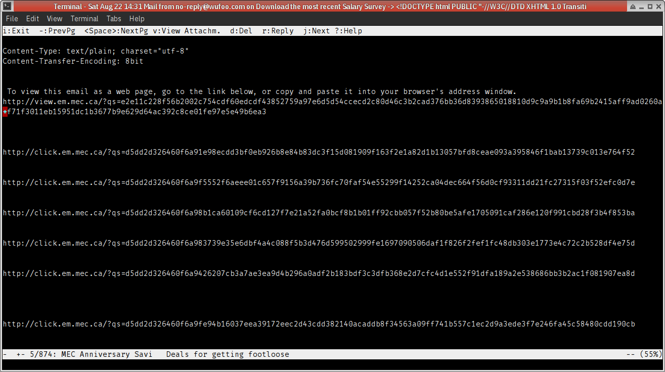
Do you think anyone who sees this kind of garbage will bother opening the images to see what the images say? (Let’s assume you actually can see.) Nope, I don’t think so?

Why then do these companies spend so much time sending garbage like this?

You can do bettter.

And some have done better. 
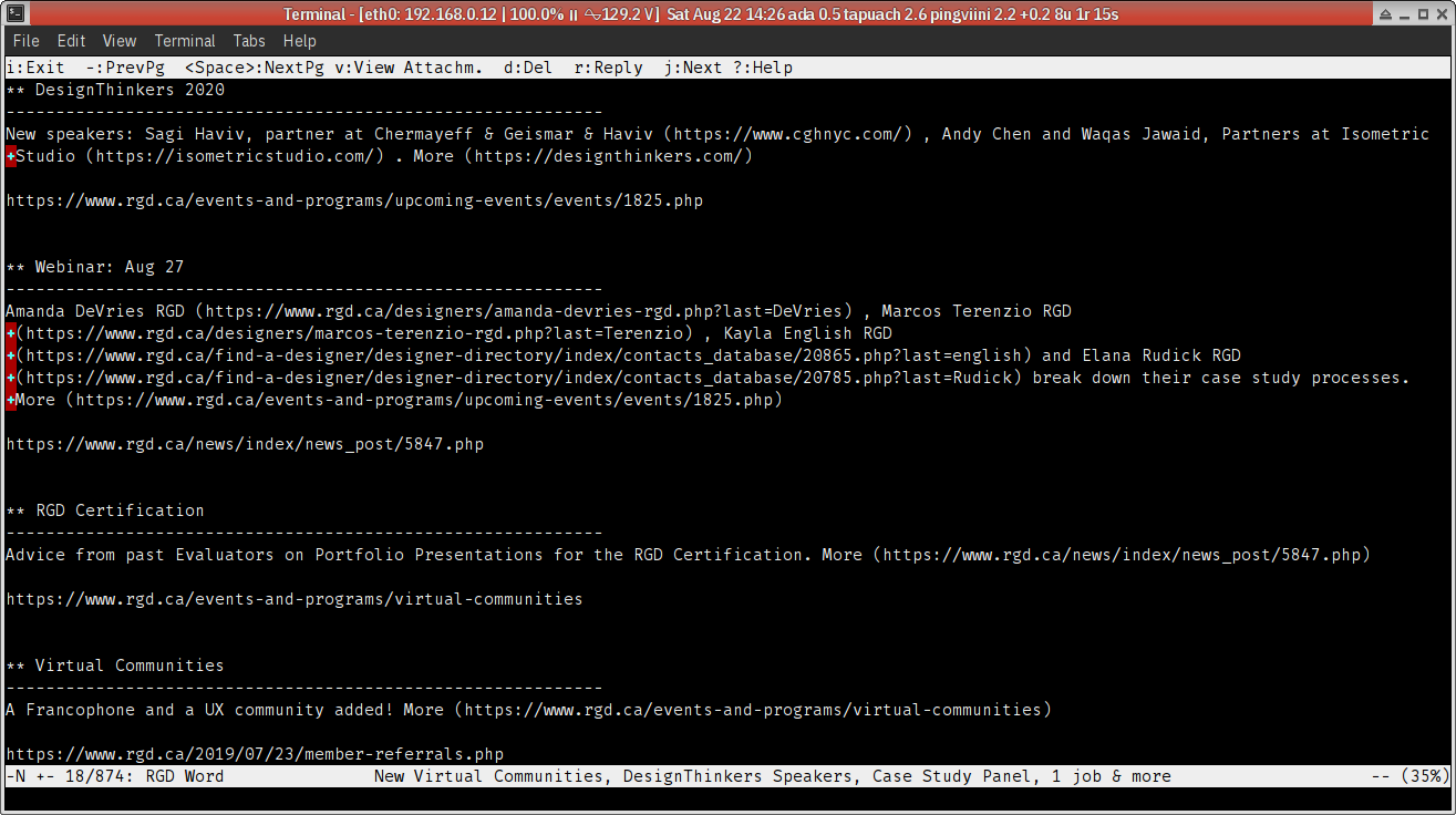
Here’s one from the Association of Registered Graphic Designers:

Screen shot of a newsletter from the RGD
A screenful of text from a recent newsletter from the RGD. The newsletter consists of readable paragraphs. Links are relatively short and pronunciable, although some can obviously be shortened further.

Which one do you prefer, as a reader?

Not all threads are created equal, I guess

After I disassembled my second prototype I’ve been trying to sew it back: Three times now and every time I ended up in failure by kinks. Now I think the thread is too thin. Not too long (I jotted down the correct length when I first sewed up the second prototype). Not insufficient waxing (in this last try — after I first noticed the probable cause — I had waxed the thread like six or seven times and it still kinked up). I must have been using a different kind of thread and never noticed the kind of thread made a difference. So this “30 weight” thread is useless. I have some upholstery nylon thread but they’re the wrong colour. I’m going to need to get some nylon thread of different colour and get some denim thread and some other kinds of thread that’s not “30 weight” and figure out what exactly I was using.

Comic book conventions are more fluid than we’re told

A while ago I attended Editors Canada’s webinar on editing comic books. So on Sunday I went to TCAF (because I didn’t even realize TCAF was last weekend until a saw a high school friend’s Instagram post — he had a presentation on Friday) and flipped though some comic books. And what did I find out? Comic books, generally speaking, don’t really follow all the “rules” we were taught. We were told that the “rules” wouldn’t apply to manga. But I didn’t see manga at TCAF. Comics from Europe do it differently. Comics in zines do it differently. Comics that are better described as experimental art do it differently. Even some locally produced ones, made right here in Toronto, do it differently. Some do it in a way that reminded me of how translated manga were typeset when I was small (i.e., they break even the seemingly unbreakable rule that text in English-language comics should look hand-lettered). Maybe half of all the comics I flipped through followed the “rules”; when I first found something that followed them I was actually surprised. And you know what? Being a reader, seeing comic books that didn’t follow the “rules” didn’t bother me a single bit. So what we were taught was a style. Apparently a fairly well-known style if what you’re aiming for is a mainstream North American aesthetic. But it’s still only a style. In the grand scheme of things, we’re talking about non-rules.

Hacking a ring-bound sketchbook (part 1)

The nice thing about ring-bound sketchbooks is that they open flat; the bad thing about them is that rings get caught and deformed or even unravelled. After having to pull my sketchbook from my bag hard (and damaging one ring in the process), I wondered if I could put a spine over the rings to protect them. So for my first try I used Canson paper. It looks like this might work (we’ll see), but the problem now is that the sketchbook no longer opens flat. Maybe a cloth spine would be better, but I don’t have a second sketchbook to try this out. Maybe I’ll rip the spine out and replace it with a cloth one if it doesn’t work or if it breaks.

sysline beeps are music, or the multisensory Unix text mode interface

I just realized how multisensory the traditional Unix text mode interface was. You would never check your mail every five minutes, because sysline would tell you when to check mail. And every half hour the beep tells you 30 minutes have passed—if you follow the 30/30/30 rule (rather than the 20/20/20 rule favoured by Canadian optometrists) you know it’s time to walk around or at least look outside the window.

If you don’t know what I’m talking about, I’ve just made somewhat of an adequate simulation, at least for sysline’s half-hour beeps. Leave it open in your browser for at least an hour.

Problems with using Acrobat to create tagged PDF files from scans

(I didn’t do screenshots when I tested on MacOSX yesterday, so no screenshots for now. This will be fixed later, but seriously, Adobe need to recommit to releasing Acrobat and/or Reader on Unix, or at least make sure Reader DC’s installer work under Wine. The status quo is unacceptable.)

Since Acrobat CC and Reader DC are really the only tools for creating tagged PDF files from a scan, yesterday I decided to see how well they actually work. (What I used was Acrobat CC on a recent MacOSX, with VoiceOver for testing. The scan was of low quality but sometimes this is what people have to work with.)

Many obvious, major problems surfaced almost right away:

  • The relevant panels and toolbars were difficult to find. You have to google to figure out where to even look.
  • Creating a tag tree will cause OCR. The result contained lots of errors, but there’s no obvious way to fix any.
  • Acrobat made many reasonable guesses at the document structure, but also many bad ones. Some could have been easily fixed by removing container elements but keeping their contents in place, but there’s no obvious way to do this.
  • Structural errors (including the above) can often be fixed by rearranging tags, but drag-and-drop is the only way to reorder tags, and your tags more often than not end up being dropped at unpredictable locations – even if you’re very careful. In other words, Adobe’s official workflow doesn’t actually work.
  • The document object model doesn’t seem to be inconsistent; you can type over the errors in the Content (“TURO”) view, but the errors remain uncorrected in the Tags view (or as revealed by reading the actual PDF with an actual screen reader).
  • When you finally found out how you’re supposed to correct OCR errors, you’d realize the automatic OCR performed by the Tags editor did not create any layers, so you’d have to redo the OCR even though it had already been done.
  • You’re given only one chance to correct “possible” OCR errors — those that Acrobat automatically identifies as “suspects”. If you made an error when correcting, too bad, you’ll have to start the OCR process all over again: There is no Undo.
  • There’s no way to correct OCR errors Acrobat fails to even identify as “suspects”.
  • The contents fields in a tag produce no observable effects; they don’t override anything.

I’ll elaborate on these later, but I’m shocked this is the kind of tool we are forced to work with if we need to “remediate” a PDF file — pretty much unusable if you asked me.

(MM told me when he had to PDF remediation he ended up re-creating almost everything, and AW said my complaints are her daily complaints. I can totally empathize. If I end up doing this kind of work, InDesign will likely end up being a major part of my workflow as well.)

Legibility research, and the perils of citing just the URL

During a recent discussion on EAE the question of the “readability” of two spaces came up. Naturally, since I originally planned to do my thesis in graphic design but failed to find relevant research, I was deeply skeptical.

At the end I was asked if I would be interested in learning about the “science” of readability and, of course, I said yes. Today the person got back to me, and this is the list she gave me, in its entirety:

  1. http://ieeexplore.ieee.org/abstract/document/6392140/?reload=true
  2. http://journals.sagepub.com/doi/abs/10.1177/1470357211434029
  3. http://www.ingentaconnect.com/content/stc/tc/2005/00000052/00000004/art00006#expand/collapse
  4. http://www.ingentaconnect.com/content/stc/tc/2000/00000047/00000003/art00009
  5. Lewenstein, M., et al. "Poynter Eyetrack Study." (2000).
  6. Quinn S., Stark P., Edmonds R. (2007) Eyetracking the News: A Study of Print and Online Reading. New York: The Poynter Institute.

I’ll leave aside my pet peeves about URL abuses for now; but when I checked the URL’s I found only a third of the list still accessible: [3] and [4] are 404’s. And [5] and [6] could not be located. Not even Google knows where [5] and [6] are: Poynter has “reorganized” their site and they haven’t placed redirects for their old links, even though there’s no way they’re not aware they have been widely cited.

When all the unlocatable citations are thrown out, the entire reference list contains only two citations.

Both of these ([1] and [2]) are behind a paywall, and I couldn’t read them at my home university. I can track them down, which I will do, and comment later when I’m better informed, but I’m already less than hopeful: [1]’s abstract shows suspicious terminology (such as “font size”) that casts doubts on the study’s methodology.

What does this mean? I don’t know, as I’m not really well informed at this point yet, but the terseness of the list still seems to suggest I wasn’t totally crazy when I tried tracking down research papers but failed.

Machine translation is IP theft, if you really think about it

“What mostly annoys human translators isn’t the arrogance of machines but their appropriation of the work of forgotten or anonymous humans,” a New York Times article writes.

I’ve never thought of it this way, but it’s entirely true. Machine translation, as bad as it is, only works because the scientists have stolen the work of countless translators and refuse to credit them as co-creators of the knowledge their machines depend on.

Newline after each sentence

A few days ago MR posted an XKCD comic that mentioned that some people put a newline after each sentence. And the way the comic is drawn seems to suggest these people are outliers. I had a lot of problems with that comic. For one, being XKCD, the artist should have known that this style is favoured by many programmers, because to do otherwise would mean havoc when diff’ing. This third group of “outliers” is actually much bigger than the artist believes. In any case, it turns out that putting a newline after each sentence has an unexpected benefit: If the text contains sentences that are too long, they literally stick out and shout at you. If your xterm is 200 columns wide and you’re still seeing tons of line wraps, you know you’ve got a major problem. This got me thinking: We really need to make it easier for people to edit tagged text, and I don’t think the current breed of “programmer’s editors” is cutting it. We need a new paradigm where distracting details can be hidden, so that the benefits of “newline after each sentence” can be exploited.
Syndicate content