Ubuntu disappoints, and software tweaks are what makes Macs usable
Submitted by Ambrose on Mon, 2016-03-14 12:36
Months after the thought came up and my first failed trials, I have finally managed to install (so to speak) Ubuntu on my Mac, and I have to say Ubuntu disappoints on many small details. Coming from a pre-GNOME traditional Unix background, that’s some major disappointment I’m talking about.
My major disappointment is with the trackpad. With Ubuntu the Mac’s trackpad is barely usable. Right-clicking doesn’t work, even with the ”Accessibility” option turned on. Heck, even single clicking often doesn’t work because the system would register some tiny, stray vertical movement so you would end up clicking the wrong thing. The system also often registers stray horizontal movements (so that, for example, when you’re scrolling through a page the browser would suddenly switch to a different tab, or even a different app). So it seems that the Mac’s trackpad isn’t actually any better than what Windows laptops have; all the perceived usability is in the software drivers and Apple has done a lot of work making sure the drivers are tweaked to screen out stray movements.
Keyboard input also disappoints. The ”English (Macintosh)” mapping does not map the non-breaking space, and Chinese input does not seem to work. (Maybe Ubuntu is trying too hard to be “smart” and I need to disable all the modern stuff and go back to xkb and scim… or maybe it’s debugging and bug report time….) It’s also a major surprise to see that Emacs-style editing keys work on MacOS X but not in Ubuntu.
With more than one input method installed, simply clicking the input menu would often, inexplicably, switch to a different input method.
The Character Map is completely writing-script-based so you can’t pick out punctuation marks and other non-letter symbols; I had to resort to using printf in the terminal to get the symbols I need.
All in all a disappointment, and in the meantime I’ll need a bigger (and hopefully faster) USB stick.


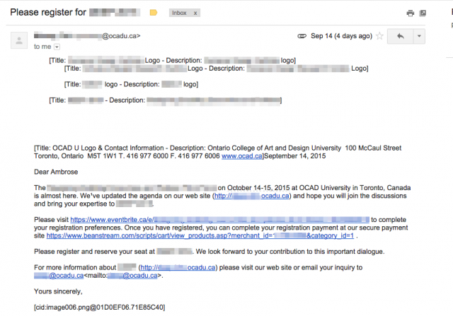 Does the endless repetition of “Title: XXXX Logo - Description: XXXX Logo” make sense to you? Does “[cid:image006.png@01D0EF06.71E85C40]” look meaningful or accessible to you? No, they don’t, but this is what you get when you blindly follow “accessibility guidelines” and trust Word to mail out form letters.
Which brings me back to a point I’ve been trying to make since first year: You can’t divorce alternate text from its true roots: As fallback for text browsers and plain-text offline formatters. In other words, as fallback for what is to be inserted in place of the image whenever — not just when the final output is speech — the final output is plain text.
This is why alternate texts that say “XXXX logo” are almost always wrong, or for that matter why (as this example shows) anything that results in “Title: X - Description: Y” is also almost always wrong.
Alternate text for screen readers was not the original intent; being usable for the screen reader is actually the curb cut. Alternate text was invented for accessibility, for sure, but the true intended medium was the text screen, not the screen reader.
Does the endless repetition of “Title: XXXX Logo - Description: XXXX Logo” make sense to you? Does “[cid:image006.png@01D0EF06.71E85C40]” look meaningful or accessible to you? No, they don’t, but this is what you get when you blindly follow “accessibility guidelines” and trust Word to mail out form letters.
Which brings me back to a point I’ve been trying to make since first year: You can’t divorce alternate text from its true roots: As fallback for text browsers and plain-text offline formatters. In other words, as fallback for what is to be inserted in place of the image whenever — not just when the final output is speech — the final output is plain text.
This is why alternate texts that say “XXXX logo” are almost always wrong, or for that matter why (as this example shows) anything that results in “Title: X - Description: Y” is also almost always wrong.
Alternate text for screen readers was not the original intent; being usable for the screen reader is actually the curb cut. Alternate text was invented for accessibility, for sure, but the true intended medium was the text screen, not the screen reader.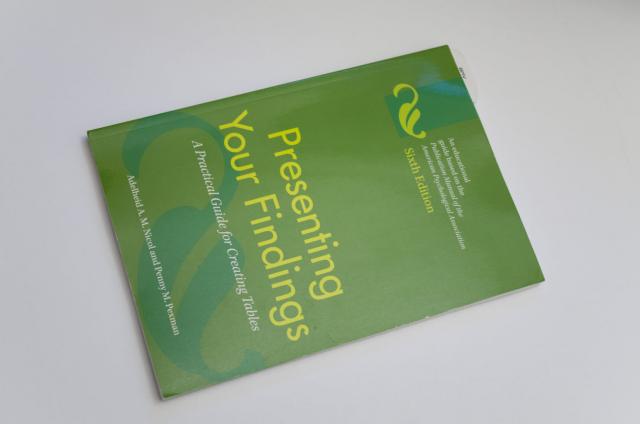 It looked exactly like the APA manual, but it’s a different colour, and it says “Presenting Your Findings” on the spine. I took it out and there it says, “Presenting Your Findings: A Practical Guide for Creating Tables,” published by the American Psychological Association.
I scanned the shelves another time to see if the other one for figures was there somewhere. Nope. I scanned it another time to make sure. Nope, not there.
Still, just this one was a very unexpected find. Who would have thought, BMV? I literally had never seen this book before, anywhere: not even at Chapters or at the U of T Bookstore.
It looked exactly like the APA manual, but it’s a different colour, and it says “Presenting Your Findings” on the spine. I took it out and there it says, “Presenting Your Findings: A Practical Guide for Creating Tables,” published by the American Psychological Association.
I scanned the shelves another time to see if the other one for figures was there somewhere. Nope. I scanned it another time to make sure. Nope, not there.
Still, just this one was a very unexpected find. Who would have thought, BMV? I literally had never seen this book before, anywhere: not even at Chapters or at the U of T Bookstore.