Yesterday I was mentioning to Emily that I couldn’t understand some of the graphic design work on the 5th floor. One looked like it came from Industrial Design. But the bulk of what I couldn’t understand looked just like installations.
Then today, while I was trying to find all my friends’ work in the final two hours, I ran into another one, Zviko Mhakayakora’s This Feels Like Home:
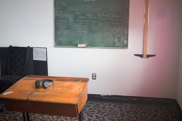
However, this time, although at first I felt puzzled for a short while, as soon as I read the artist’s statement I thought, “Of course this is graphic design!”
Context made all the difference. The designer framed this as an educational exhibit, and it clicked on me: This is environmental graphic design work for a museum exhibition. Graphic designers do this kind of work all the time.
So EGD is being taught at OCAD, and I think it appears to be taught well. One day, maybe OCAD’s campus will actually have good EGD.
Almost a year after I printed a copy of my thesis (intending to put it on display at GradEx, but shelved the idea when I thought the print shop didn’t print it), I finally took a few hours to gather all the signatures, sew them together, and glue them together into what vaguely looks like a book. It’s still not in book form only because my X-acto is with my box of tools in the studio and I forgot to print the cover.
Yes, of course this was going to be in the form of a real book, because that’s how all the process books at GradEx look like! :-)
Anyway, while I was doing this, I kept thinking things like “I’ve forgotten what the signature size was”, “I’m supposed to know how to do this”, “too many signatures!” and “I think I did this wrong,” A year after I did the Student Press’s bookbinding workshop I have already forgotten how to sew signatures together.
I still managed to bind the whole thing together. I’m going to get my X-acto back tomorrow and do a layout of a front cover and print it out somewhere… (Hmm… that will have to be printed at 12×18…)
(Oh yeah… and don’t bother to use staplers. Thread and needle is actually easier because you have more control. And awls… they make holes that are too big; I actually like pins better…)
How we handled GradEx is full of missed opportunities. Not only have we missed it as an opportunity to put inclusive design into practice, we’ve also missed it as an opportunity to make design observations.
CH’s suggestion to have my shelves arranged as a ladder made it possible to observe visitor heights vs shelf heights. Of course, whether I made the observations is another matter: I didn’t, except for yesterday’s observation of how a person on a wheelchair interacted with the shelves and how today a little girl interacted with the bottom shelf, I made no observations.
I think the rearrangement of the chairs is working. It’s more logical. At the very least they announce “Look! We’ve got a video here!” Interestingly, most people do not sit on the chairs. They just stand and watch the video.
We really should have videotaped the whole thing just for all the missed observations. If we’re allowed to, of course. And hindsight is always 20/20.
DK and I chatted a bit yesterday about GradEx. We quickly went to “What is the point of this exhibition,” then to “Our program has no personality,” and then beyond. But as I pondered this today I realized that the fact that our program has no personality is not a showstopper.
Bringing organization to disorganized elements and imposing a scheme to a composition that has no harmony shouldn’t be something foreign to us: This is what graphic designers do.
I still remember during the post-conference townhall at AIGA’s 2012 “Pivot” conference when Ric Grefé talked about the importance of keeping our “craft” or risk losing our “specialness.” I was skeptical we had anything special to talk about. Doesn’t everyone have our technical skills these days? And then I was not even a good graphic designer.
But the amazing thing is that even a not-so-good graphic designer who has never even been properly trained was able see problems that even people trained in other design disciplines apparently failed to see. I see this as validation of Ric Grefé’s claim: We do have something special (I still don’t know what it is), and our specialness does not lie in our technical software skills—our “craft” is something else.
Which I believe brings us back to “What is the point of this exhibition.” When I chatted with the guy who’s showing sculpture next doors today one thing I mentioned was that I wanted to do GradEx because I didn’t feel I finished until I do this. When NW said it’s almost finished and I said “Two more days!” I really felt those were the right words to say.
For a design student, the end is not having thesis done (“I thought thesis was hell; GradEx is also hell,” as relayed by RT), neither is it having technically graduated (as I so call my awkward situation), nor is it convocation; the end is having gone through GradEx, in all its “hellish” ways. Like what DEEP and INCD’s “Culminating Festival” should have been, GradEx is a full environmental graphic design (EGD) project, complete with inclusivity and accessibility issues to solve.
This year’s two cohorts have not tackled it rightly, as an inclusive design problem (to be fair, neither has OCAD Administration tackled it rightly, as an EGD problem), so we have mostly squandered the precious opportunity. I wish next year’s cohort will take GradEx more seriously for what it is—an EGD project worthy of tackling from an inclusive design viewpoint.
I thought I liked this year’s map. At least the sale is on the map. But people have asked UH enough weird questions that she suspected the map isn’t showing stairs or elevators or how to get to other buildings.
But I just checked the map and these things are all there. Yet people aren’t finding this information. This is a failure of the graphic design.
And the app? Sorry, it might have been a cool idea, but people aren’t using the app as far as I can see. People are asking me where to find the paintings. People aren’t using the app; they’re using the printed maps. And 21 colour codes with neither alternate text nor icons is non-inclusive design.
Last years I thought the signs were bad. This year’s signs are no better.
And showing at GradEx certainly changed my views of just how bad our signs are. People don’t know where they can find more things on the first floor. We have no directional signage.
All this is embarassment for a design school.
Someone asked me a seemingly-random question this morning: The two chairs, are they just random, or have they been designed to be placed there so something looks better when I sit on them?
Not so random really, is it? They should not have been just placed there randomly, and once I thought of that it’s obvious where they should have been placed: In front of the monitor.
Every exhibition where films are shown have benches or chairs for people to sit on. We have a short film. The only logical place chairs should be placed is in front of the screen, so that people can sit down and watch the film.
Also, I tried changing the lighting. If we turned off two thirds of the lighting it’s more obvious that we’re showing a film, but then the posters wouldn’t get sufficient lighting. This means two things: Posters should have had their own lighting, and where we’ve had put the screen isn’t really the best place the screen could have been placed.
And people don’t realize what’s on the wall are lyrics. Maybe we should have had better signage. No, we definitely should have had better signage.
And of course if I knew I would be doing lighting for my shelves I would have made a wooden box or something to house the messy cables.
Everything have been placed in the room piecemeal, without regard to what the whole should look like. People are confused because our program has no personality, but also because we have not designed the space to create more coherence. We could have done better—at the least as well as MAAD.
PS: Oh yea, we probably should have had a book for people to sign and leave comments too.
I’ve spent so much on GradEx that at OCAD I’ve literally only spent more on tuition.
Anyway, after talking with RT yesterday I went to Canadian Tire today to look for lighting systems. To my utter surprise, I found
absolutely nothing. So I walked over to IKEA because I actually knew they have LED lighting systems.
So after spending more time than I should, I settled on the
Omlopp countertop light because it seemed to look the best—even though it’s exceeding expensive for what I was going to do. The Omlopp is a complicated system and I actually managed to forget to get the power cord and had to later go back to IKEA to get it, losing two hours of precious setup time.
There’s also something about the shelving system I’ve chose that really bugged me: The
Ekby Laiva is decent enough, but to install the
Ekby Valter bracket with a power screwdriver is next to impossible. You can’t even use a normal manual screwdriver; you pretty much has to use an “offset screwdriver” because the spaces are so tight.
In any case let me get back to my point: after I tried installing the light to the second shelf a serious design problem with the Omlopp became very obvious—You can’t remove it. And I know this very well because I actually managed to install my second Omlopp backwards and after trying to pry it off (in order to fix it) for maybe half an hour I just gave up and concluded that prying it off is simply impossible.
Yes, you read that right: Once you’ve installed the Omlopp on anything you can’t take it back out. An Omlopp that has been “clicked” into place is as good as having been epoxied onto the shelf. The shelf and the light are now one; you can’t even repaint the shelf now.
It’s not that I haven’t seen stupid IKEA designs, but the Omlopp has to be the stupidest design I’ve ever seen, and it’s mighty expensive. If there’s anything I’m getting from this expensive exercise, it’s “Do not buy Omlopp.”
This past couple of days I’ve been telling people that my GradEx setup is a disaster. When it comes to 3D spaces I’m still a graphic designer, not an artist. I didn’t have time to finish my layout so I had to improvise, and I just can’t do it. Or at least that’s what I thought.
When I was walking to the subway station today (basically after giving up for the day, not after finishing any significant amount of work) I suddenly realized something: The disaster that it is is still a graphic design problem—not an art problem, not an architecture problem, not even necessarily an environmental design problem. All that’s changed is that the shelves are now in place and their place is fixed, but this doesn’t make it not a graphic design problem; this just changed the problem so that it now has an additional constraint.
Which means it’s not a problem I can’t solve. In fact, if anything, the problem should now be easier to solve because it’s now better defined. I’m not sure if I can solve it in time but this is definitely still within my area…
Yesterday when I tried to get into MCA 140 to check the ceiling (because I forgot to photograph it the last time I was there) it was locked. I figure since crits aren’t officially finished until today the room probably would be unlocked today.
Sure enough, when I tried to check the room today it was unlocked. But what stuck out was the smell: the smell of fresh paint. The room has been repainted.
But why bother to repaint it now if most students doing GradEx are going to repaint their rooms anyway? I’m not saying we’re going to (I really want to if I can figure out how to deal with the air vents and ducts—and of course if I can convince everyone else in my program), but I’m genuinely curious.
For the record,
this was essentially what I sent to our program’s coordinator yesterday. I fixed one typo but other than that this is identical to what I sent her.