Why blindly following accessibility guidelines isn’t always a good idea
Submitted by Ambrose on Fri, 2015-09-18 15:02
I have not been logging in to my student email as often as before, and when I logged in earlier today I noticed this — am I allowed to use the word travesty? —:
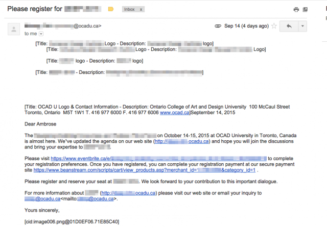 Does the endless repetition of “Title: XXXX Logo - Description: XXXX Logo” make sense to you? Does “[cid:image006.png@01D0EF06.71E85C40]” look meaningful or accessible to you? No, they don’t, but this is what you get when you blindly follow “accessibility guidelines” and trust Word to mail out form letters.
Which brings me back to a point I’ve been trying to make since first year: You can’t divorce alternate text from its true roots: As fallback for text browsers and plain-text offline formatters. In other words, as fallback for what is to be inserted in place of the image whenever — not just when the final output is speech — the final output is plain text.
This is why alternate texts that say “XXXX logo” are almost always wrong, or for that matter why (as this example shows) anything that results in “Title: X - Description: Y” is also almost always wrong.
Alternate text for screen readers was not the original intent; being usable for the screen reader is actually the curb cut. Alternate text was invented for accessibility, for sure, but the true intended medium was the text screen, not the screen reader.
Does the endless repetition of “Title: XXXX Logo - Description: XXXX Logo” make sense to you? Does “[cid:image006.png@01D0EF06.71E85C40]” look meaningful or accessible to you? No, they don’t, but this is what you get when you blindly follow “accessibility guidelines” and trust Word to mail out form letters.
Which brings me back to a point I’ve been trying to make since first year: You can’t divorce alternate text from its true roots: As fallback for text browsers and plain-text offline formatters. In other words, as fallback for what is to be inserted in place of the image whenever — not just when the final output is speech — the final output is plain text.
This is why alternate texts that say “XXXX logo” are almost always wrong, or for that matter why (as this example shows) anything that results in “Title: X - Description: Y” is also almost always wrong.
Alternate text for screen readers was not the original intent; being usable for the screen reader is actually the curb cut. Alternate text was invented for accessibility, for sure, but the true intended medium was the text screen, not the screen reader.