That is why they do it in SuperCollider
Submitted by Ambrose on Mon, 2014-09-01 11:45
Submitted by Ambrose on Mon, 2014-09-01 11:45
Submitted by Ambrose on Tue, 2013-04-23 14:05
Submitted by Ambrose on Sun, 2013-04-14 08:22
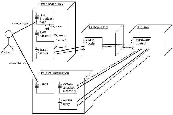
 How should we even describe this as an “alt text”? (Let’s ignore text browser users for the moment.) Describing the picture certainly wouldn’t work; what matters are not the visual elements themselves, but their relationships to each other.
Even worse: Imagine this being exported into PDF (or SVG, or EPS), then embedded into InDesign. Suppose the InDesign file is going to ultimately end up as an accessible PDF. But the text in the diagram is going to be a jumbled mess. So what accessibility are we talking about? Are we deluding ourselves?
This has serious implications: Imagine, for example, a piece of online instructional material full of such diagrams. Under the AODA organizations are supposed to be able to supply this in an “accessible format.” What does it even mean for this to be accessible?
How should we even describe this as an “alt text”? (Let’s ignore text browser users for the moment.) Describing the picture certainly wouldn’t work; what matters are not the visual elements themselves, but their relationships to each other.
Even worse: Imagine this being exported into PDF (or SVG, or EPS), then embedded into InDesign. Suppose the InDesign file is going to ultimately end up as an accessible PDF. But the text in the diagram is going to be a jumbled mess. So what accessibility are we talking about? Are we deluding ourselves?
This has serious implications: Imagine, for example, a piece of online instructional material full of such diagrams. Under the AODA organizations are supposed to be able to supply this in an “accessible format.” What does it even mean for this to be accessible?Submitted by Ambrose on Wed, 2013-04-10 03:19
Submitted by Ambrose on Sun, 2012-11-25 13:56
Submitted by Ambrose on Wed, 2012-10-17 01:04
Since some of us are talking about aChecker, I threw my own site at it and it spewed out a slew of complaints. I didn’t assume my site was flawless (in fact I knew it had many problems), but the amount of complaints it threw at me was just too much.
I mean, some of what it spew back at me was justified. (For example, I didn’t know WCAG requires the lang attribute to be tagged onto the HTML element instead of the BODY element—not that the requirement made any sense.) But some of it was just bogus. Contrast problems for non-textual elements that happens to be text? With the advent of webfonts, textual data can be anything (especially when people have started talking about using specialized dingbat fonts as a replacement for graphics). You just can’t infer that a piece of textual data will be actual text, especially when the glyphs concerned are obviously symbols.
The problem is that these requirements are divorced from both the context of what the text is and how the text is actually used.
So I wonder: Will the mandatory adoption of WCAG actually produce the opposite effect of what is intended? Will people, out of the requirement (as opposed to the desire) to be compliant with the WCAG, forego simple text for graphics, throwing the web back to where it was 10 years ago when heavy graphics ruled? I don’t want to believe in this, but if WCAG 2.0 AA is going to become mandatory, I think this will be a very real possibility.
Submitted by Ambrose on Fri, 2012-09-07 23:40
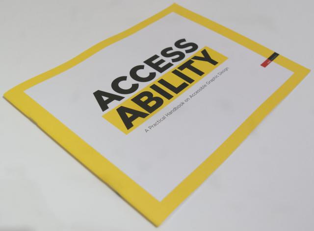
 Obviously, three weeks ago I already found Inclusive Design : A Universal Need in the OCAD library. However, the primary focus of that book was interior design and architecture, fields that I wouldn’t be qualified to even touch.
So I was definitely very happy to have found something from none other than RGD Ontario. For one, this means there is something about graphic design to talk about; and secondly, it means that this something is not some obscure, fringe thing that has no consequence—in other words, I am not crazy or wasting my time trying to steer my direction away from digital technologies…