Submitted by Ambrose on Thu, 2014-09-11 11:15
I have been somewhat critical of OCAD’s new signage system. I admit I don’t really like the new aesthetics, but there really is something more; for example there is this:
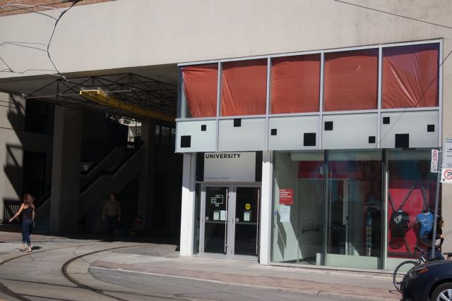 As can be clearly seen from the photo, from across the street the sign reads only “University”; the first part of the sign, “OCAD,” is missing. However, if we are walking towards the building on the same side of the street, we find that the sign, as designed, should not have any part cut off:
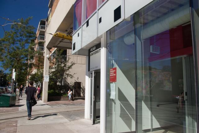
 What’s happening is that the vertical overhang is blocking the line of sight to the upper part of the sign when viewed from across the street, and—no matter whether this is intentional or not—it makes people think that the designer had not taken the vertical overhang into account.
I find this really ironic: when I was in first year we did a bunch of EGD things which were just temporary signage, and the irony is that even I—a student with no EGD training—took the effort to try to make sure that any sign we made would not have visibility issues (given the restrictions imposed by our materials and fabrication method, of course). Yet this sign has two obvious visibiity issues:
What’s happening is that the vertical overhang is blocking the line of sight to the upper part of the sign when viewed from across the street, and—no matter whether this is intentional or not—it makes people think that the designer had not taken the vertical overhang into account.
I find this really ironic: when I was in first year we did a bunch of EGD things which were just temporary signage, and the irony is that even I—a student with no EGD training—took the effort to try to make sure that any sign we made would not have visibility issues (given the restrictions imposed by our materials and fabrication method, of course). Yet this sign has two obvious visibiity issues:
As can be clearly seen from the photo, from across the street the sign reads only “University”; the first part of the sign, “OCAD,” is missing. However, if we are walking towards the building on the same side of the street, we find that the sign, as designed, should not have any part cut off:
What’s happening is that the vertical overhang is blocking the line of sight to the upper part of the sign when viewed from across the street, and—no matter whether this is intentional or not—it makes people think that the designer had not taken the vertical overhang into account.
I find this really ironic: when I was in first year we did a bunch of EGD things which were just temporary signage, and the irony is that even I—a student with no EGD training—took the effort to try to make sure that any sign we made would not have visibility issues (given the restrictions imposed by our materials and fabrication method, of course). Yet this sign has two obvious visibiity issues:
- From a vantage point that would have been identified during traffic analysis, the sign is cut off;
- From the same vantage point, the sign might be too small (i.e., illegible) for some people, a problem that would have been identified during prototype testing.