New signage spotted at OCAD, and it’s bad, as usual (sigh)
Submitted by Ambrose on Sun, 2014-10-12 02:58
A couple of days ago (I think it was probably Tuesday, but it could have been Monday) I sat down at the food court and — lo and behold — I spotted new signage:
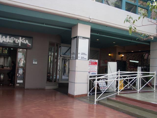 Unfortunately, it’s, as usual, bad. Just a quick glance immediately revealed obvious problems, such as, “where exactly is the Annex Building?”
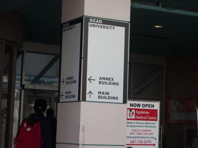 Since the arrow directly in front of me points to my left, naturally I looked left — but a sign was nowhere to be found. In other words, if a veritable visitor is to step inside the food court, they would be utterly lost as to where the Annex Building actually is:
 Since the other arrow actually points towards the Annex Building what I did next was to look in that direction. But this is what replaced the big, old Ontario College of Art and Design sign:
![Directional signage point to “Library Classrooms” and “Learning Centre” [sic]](http://incd.ambroseli.ca/sites/default/files/images/CRW_1494_0.preview.jpg)
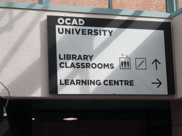 Many things are wrong with this sign (such as it’s not the Learning Centre but the Learning Zone, which is also considered a library so the sign is really pointing to not one library but two), but for the moment let’s just say the visitor will follow both arrows and see the big sign. Unfortunately they would still not know where the “Annex Building” is because it’s not mentioned anywhere on the big sign. For whatever reason, even though the big sign marks the entrance to the Annex Building, there is no identification signage.
It feels, again, as if either a traffic analysis was never performed, a sign schedule was never produced, no one checked the design documents for obvious errors, or — God forbid — no one ever even asked for any design documents to be produced.
Let us pause for a moment here. I now know Facilities (as opposed to a design department as one might expect) handles signage, but this is still inexcusable: Even if most people in Facilities have no knowledge of EGD, someone still must know enough EGD to check the quality of any tenders. As it stands, if this is a tendered project then either really no one in Facilities knows any EGD, or OCAD’s tender process does not require EGD designs to produce design specs; on the other hand, if this is an in-house job, then shame on whoever did the design — OCAD staff should at least know how to spell the name of the library on the first floor.
I simply cannot understand how any of these scenarios could have happened. And it boggles the mind that errors so glaring that a student who has never been properly trained in EGD can spot on sight have slipped through the school bureaucracy unnoticed.
Please, spend fewer dollars on marketing and more on proper design. What OCAD needs is not more empty words saying how great we are but some proper EGD on campus (I’m not even asking for award-winning EGD) — some good design to show the world that OCAD is capable of teaching students good design — when instead what we see every day is so embarrassing it’s akin to saying our profs are incompetent. Until our EGD is fixed marketing won’t fix whatever image problem the school’s trying to fix.
Many things are wrong with this sign (such as it’s not the Learning Centre but the Learning Zone, which is also considered a library so the sign is really pointing to not one library but two), but for the moment let’s just say the visitor will follow both arrows and see the big sign. Unfortunately they would still not know where the “Annex Building” is because it’s not mentioned anywhere on the big sign. For whatever reason, even though the big sign marks the entrance to the Annex Building, there is no identification signage.
It feels, again, as if either a traffic analysis was never performed, a sign schedule was never produced, no one checked the design documents for obvious errors, or — God forbid — no one ever even asked for any design documents to be produced.
Let us pause for a moment here. I now know Facilities (as opposed to a design department as one might expect) handles signage, but this is still inexcusable: Even if most people in Facilities have no knowledge of EGD, someone still must know enough EGD to check the quality of any tenders. As it stands, if this is a tendered project then either really no one in Facilities knows any EGD, or OCAD’s tender process does not require EGD designs to produce design specs; on the other hand, if this is an in-house job, then shame on whoever did the design — OCAD staff should at least know how to spell the name of the library on the first floor.
I simply cannot understand how any of these scenarios could have happened. And it boggles the mind that errors so glaring that a student who has never been properly trained in EGD can spot on sight have slipped through the school bureaucracy unnoticed.
Please, spend fewer dollars on marketing and more on proper design. What OCAD needs is not more empty words saying how great we are but some proper EGD on campus (I’m not even asking for award-winning EGD) — some good design to show the world that OCAD is capable of teaching students good design — when instead what we see every day is so embarrassing it’s akin to saying our profs are incompetent. Until our EGD is fixed marketing won’t fix whatever image problem the school’s trying to fix.
Unfortunately, it’s, as usual, bad. Just a quick glance immediately revealed obvious problems, such as, “where exactly is the Annex Building?”
Since the arrow directly in front of me points to my left, naturally I looked left — but a sign was nowhere to be found. In other words, if a veritable visitor is to step inside the food court, they would be utterly lost as to where the Annex Building actually is:
Since the other arrow actually points towards the Annex Building what I did next was to look in that direction. But this is what replaced the big, old Ontario College of Art and Design sign:
Many things are wrong with this sign (such as it’s not the Learning Centre but the Learning Zone, which is also considered a library so the sign is really pointing to not one library but two), but for the moment let’s just say the visitor will follow both arrows and see the big sign. Unfortunately they would still not know where the “Annex Building” is because it’s not mentioned anywhere on the big sign. For whatever reason, even though the big sign marks the entrance to the Annex Building, there is no identification signage.
It feels, again, as if either a traffic analysis was never performed, a sign schedule was never produced, no one checked the design documents for obvious errors, or — God forbid — no one ever even asked for any design documents to be produced.
Let us pause for a moment here. I now know Facilities (as opposed to a design department as one might expect) handles signage, but this is still inexcusable: Even if most people in Facilities have no knowledge of EGD, someone still must know enough EGD to check the quality of any tenders. As it stands, if this is a tendered project then either really no one in Facilities knows any EGD, or OCAD’s tender process does not require EGD designs to produce design specs; on the other hand, if this is an in-house job, then shame on whoever did the design — OCAD staff should at least know how to spell the name of the library on the first floor.
I simply cannot understand how any of these scenarios could have happened. And it boggles the mind that errors so glaring that a student who has never been properly trained in EGD can spot on sight have slipped through the school bureaucracy unnoticed.
Please, spend fewer dollars on marketing and more on proper design. What OCAD needs is not more empty words saying how great we are but some proper EGD on campus (I’m not even asking for award-winning EGD) — some good design to show the world that OCAD is capable of teaching students good design — when instead what we see every day is so embarrassing it’s akin to saying our profs are incompetent. Until our EGD is fixed marketing won’t fix whatever image problem the school’s trying to fix.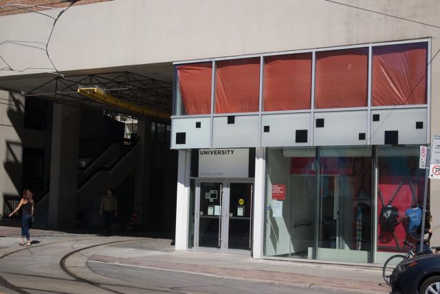 As can be clearly seen from the photo, from across the street the sign reads only “University”; the first part of the sign, “OCAD,” is missing. However, if we are walking towards the building on the same side of the street, we find that the sign, as designed, should not have any part cut off:
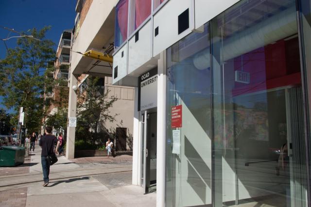 What’s happening is that the vertical overhang is blocking the line of sight to the upper part of the sign when viewed from across the street, and—no matter whether this is intentional or not—it makes people think that the designer had not taken the vertical overhang into account.
I find this really ironic:
What’s happening is that the vertical overhang is blocking the line of sight to the upper part of the sign when viewed from across the street, and—no matter whether this is intentional or not—it makes people think that the designer had not taken the vertical overhang into account.
I find this really ironic: 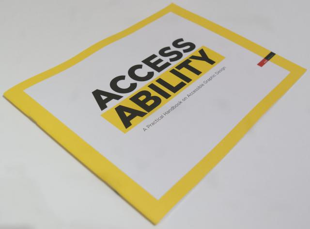 Obviously, three weeks ago I already found Inclusive Design : A Universal Need in the OCAD library. However, the primary focus of that book was interior design and architecture, fields that I wouldn’t be qualified to even touch.
So I was definitely very happy to have found something from none other than RGD Ontario. For one, this means there is something about graphic design to talk about; and secondly, it means that this something is not some obscure, fringe thing that has no consequence—in other words, I am not crazy or wasting my time trying to steer my direction away from digital technologies…
Obviously, three weeks ago I already found Inclusive Design : A Universal Need in the OCAD library. However, the primary focus of that book was interior design and architecture, fields that I wouldn’t be qualified to even touch.
So I was definitely very happy to have found something from none other than RGD Ontario. For one, this means there is something about graphic design to talk about; and secondly, it means that this something is not some obscure, fringe thing that has no consequence—in other words, I am not crazy or wasting my time trying to steer my direction away from digital technologies…